Plan-Apps Product Design System
Brand identity, Design System, Components, Style guides
2025
Project Details:
Role: UX Architect - SMG (Plan-Apps Platform)
Duration: 6 months
Team: Product Designers, Developers, Product Managers
Tools Used: Figma
Project Overview
The objective of this project was to lead the creation of a comprehensive product design system for Plan-Apps, a product that previously lacked a unified design system and had been built by developers without a formal design structure. My goal was to establish a system from scratch using Figma, applying the Atomic Design methodology to ensure scalability, modularity, and consistency across the product. I developed a clear style guide and conducted thorough WCAG accessibility testing for each component to ensure the system was not only visually cohesive but also fully accessible to all users. The resulting design system improved collaboration, streamlined development, and enhanced the overall user experience
Competitor Analysis
As product design systems have become essential for large companies scaling their brands, it was crucial to begin by analyzing the design systems of leading businesses for inspiration. I researched systems from Atlassian, Shopify, Ant Design, Salesforce, Uber, GOV.uk, Google Material Design, IBM, Apple, and Microsoft Fluent. This research provided valuable insights into best practices for structuring design systems, defining key components, and presenting guidelines in a way that developers can easily implement in code.
A key insight from my research was the use of Atomic Design, an industry-standard methodology for creating design systems. Atomic design breaks down the process into five stages: Atoms, Molecules, Organisms, Templates, and Pages, enabling a more deliberate and hierarchical approach. I applied this methodology to the Plan-Apps product design system for its modularity, reusability, and scalability. By decomposing designs into smaller components, atomic design ensures consistent branding, enhances collaboration efficiency, and improves team satisfaction.
Product Design System Style Guide UI
Typography
Colours
Iconography
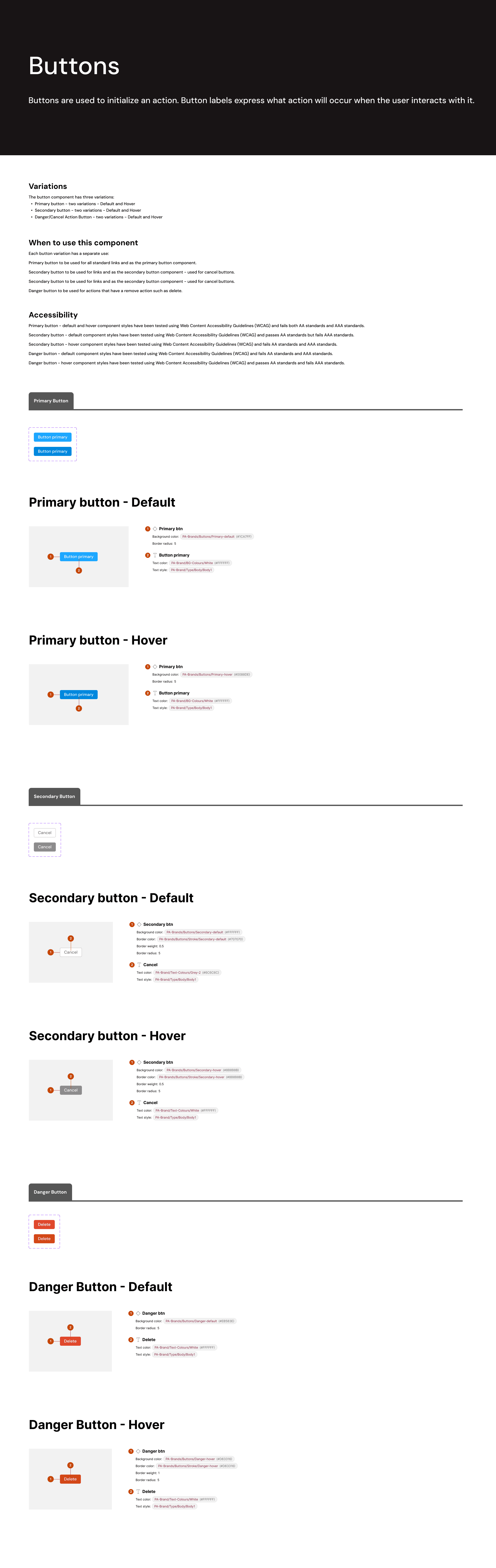
Buttons
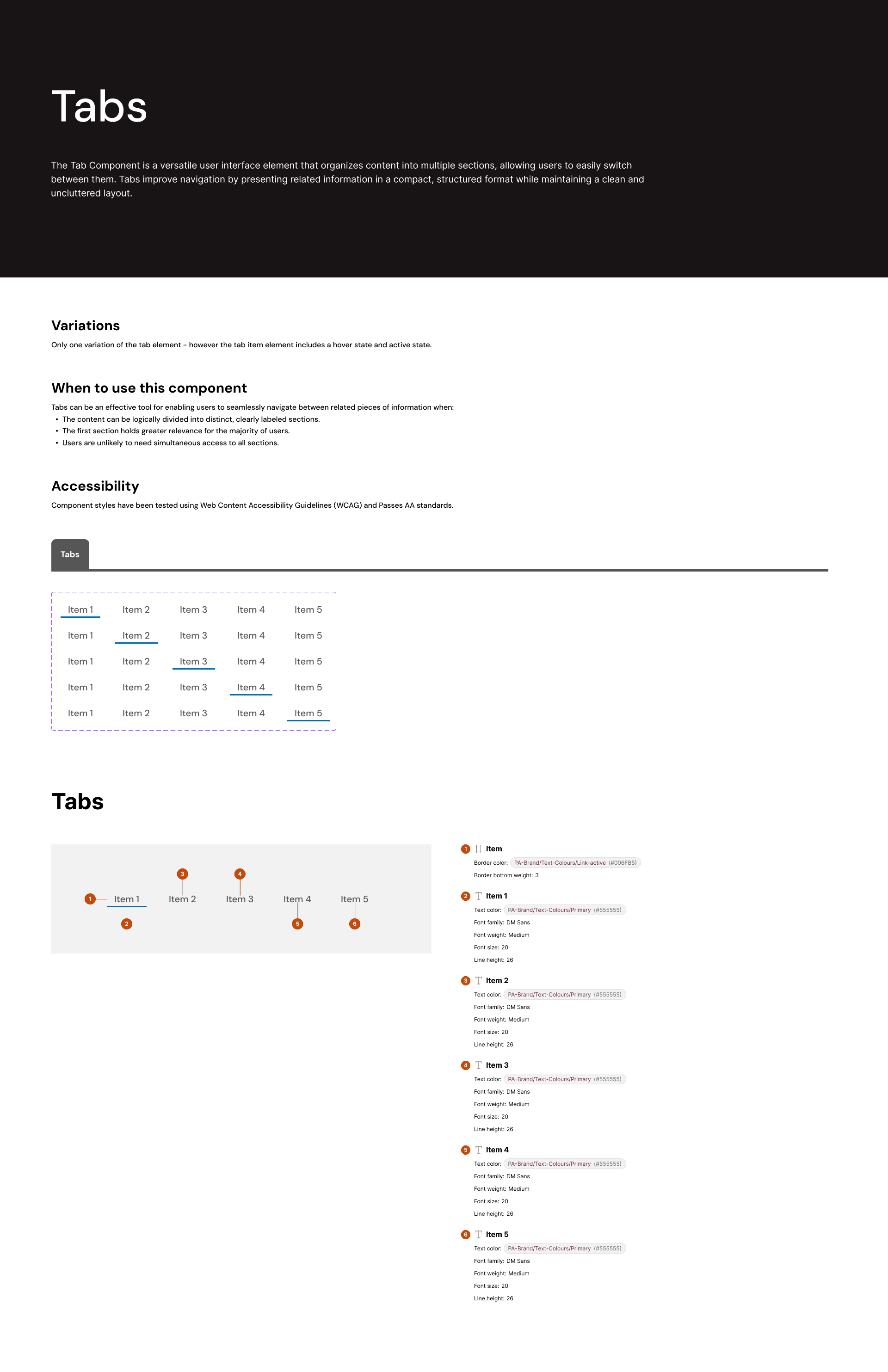
Tabs
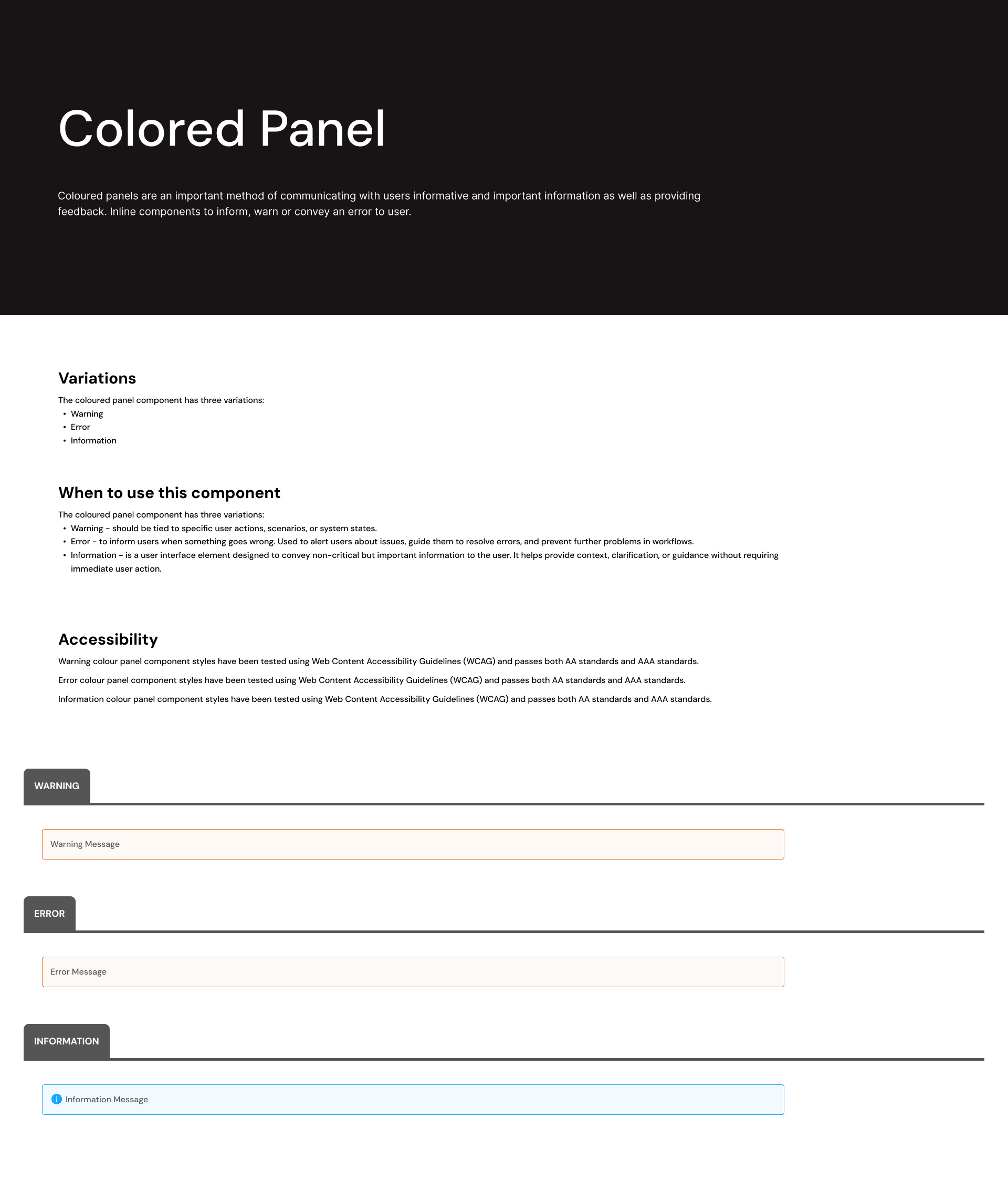
Coloured Panels
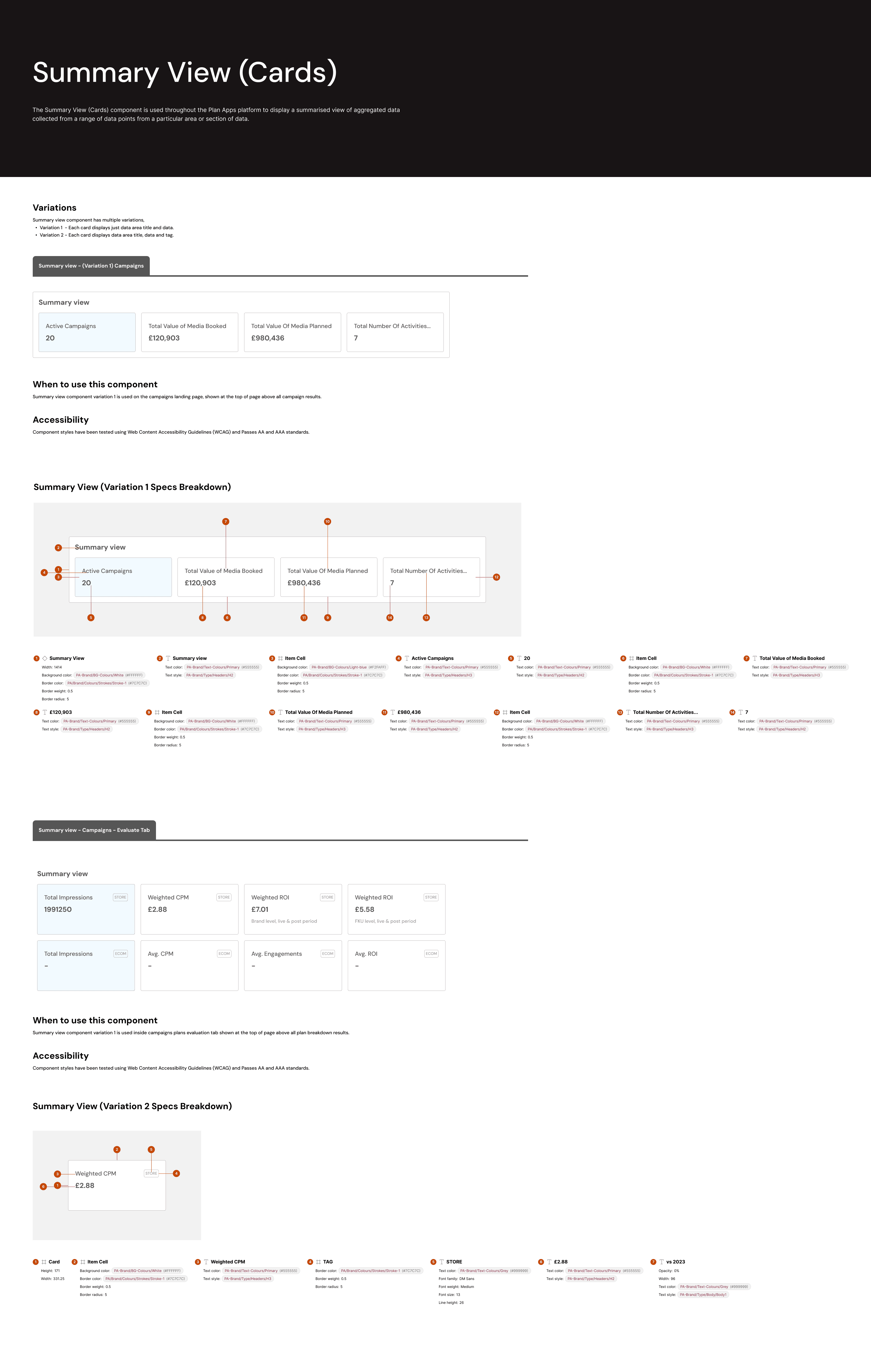
Summary View Cards
Handover Process Overview - Product & developers
To ensure seamless collaboration between design and development teams, I utilized Figma’s Dev Mode during the handover process. This feature allowed me to provide developers with clear, accessible details for each component, including styling, structure, and spacing. By structuring the design system in Figma, developers had immediate access to precise measurements, color values, typography styles, and component states—everything necessary to efficiently translate the designs into code. This approach streamlined the development process, ensuring consistency and alignment with the overall product vision. The result was a smooth, well-supported handover that empowered the development team to implement the design system effectively and maintain high-quality, cohesive designs throughout the product.
Results and Impact
The implementation of the Atomic Design System had a significant and positive impact on the company, leading to a more efficient and scalable product development process. By breaking down the design into modular components, the system ensured consistency across the entire Plan-Apps product, reducing redundancy and enabling faster iteration. The clear structure also made it easier for the design and development teams to collaborate, resulting in smoother handoffs and faster implementation. Additionally, the use of reusable components allowed the team to scale the product more easily, ensuring that new features could be integrated without disrupting the overall design. Ultimately, the atomic design system improved the product’s user experience, enhanced team productivity, and set a strong foundation for future growth and innovation.
Conclusion
The development of the Product Design System (PDS) was a transformative process that not only addressed the challenges of design inconsistency and inefficiency but also set the stage for future scalability and smoother collaboration across teams. By creating a unified set of components, guidelines, and best practices, the design system ensured that the product’s user interface was consistent, intuitive, and adaptable. The collaborative effort between design, development, and product teams resulted in a more efficient workflow, reducing production time and enabling faster iteration. Ultimately, the design system not only enhanced the product’s overall quality but also empowered the team to deliver cohesive, high-impact user experiences, driving long-term success and growth for the product.