Plan-Apps Dashboard 3.0
Marketing and media planning web platform
2025
Project Details:
Role: UX Architect - SMG (Plan-Apps Platform)
Duration: 6 months
Team: Product Designers, Developers, Product Managers a
Tools Used: Figma, Miro
Project Overview: Enhancing Plan Apps Dashboard 2.0 to 3.0
The objective of this project was to lead the product design development for an improved version of the existing Plan Apps Dashboard 2.0 and oversee the creation of Dashboard 3.0. The updated version aimed to enhance functionality and user experience by incorporating a more comprehensive product offering.
The primary objective of the Dashboard 3.0 project was to develop a highly intuitive and user-centric platform that streamlines complexity and enables brands to make smarter, data-driven decisions. By integrating AI-powered recommendations, the dashboard enhances decision-making efficiency and delivers actionable insights with greater speed and precision.
Challenges of existing Dashboard 2.0
The existing Dashboard 2.0 had several limitations, including:
Restricted access, available only to subscribers
Basic filtering capabilities
Lack of intuitive user experience
Absence of first-party data integration
No AI-powered features
Project Approach
To ensure a user-centric redesign, extensive user research was conducted with key product user types. The goal was to identify areas for improvement and define the necessary enhancements for Dashboard 3.0. Insights from this research guided the development of an upgraded platform with a more intuitive interface, enhanced data capabilities, and AI-driven features, ultimately delivering a more robust and valuable product experience.
Competitor Analysis: Braincrush & Zitcha
As part of the UX research for the Dashboard 3.0 project, we conducted a competitive analysis to benchmark industry standards, identify gaps, and uncover opportunities for differentiation. Two key competitors analyzed were Braincrush and Zitcha, both offering digital product dashboards with overlapping functionalities.


Key Takeaways from Competitor Research & Differentiation Strategy
Based on this analysis, Dashboard 3.0 was designed to balance advanced data capabilities with an intuitive user experience, addressing pain points observed in competitors. Our approach focused on:
Simplicity & Usability – Unlike Braincrush, our dashboard simplifies complexity with a more intuitive and accessible interface.
AI-Driven Insights – Leveraging AI to provide actionable recommendations, improving on Zitcha’s automation strengths.
Customization & Scalability – Offering flexible filtering and personalized features to cater to a broader user base.
First-Party Data Integration – Enabling deeper, more accurate insights compared to competitors with limited data access.
By addressing these areas, Dashboard 3.0 positioned itself as a smart, scalable, and user-friendly solution that empowers brands to make faster, more informed decisions.
UX Process for Dashboard 3.0
Creating an enhanced and intuitive Dashboard 3.0 required a structured UX process that focused on user needs, industry best practices, and AI-driven innovation. Below is an overview of the UX design approach followed in this project.
1. Discovery & Research
Objective: Understand user pain points, business goals, and market landscape.
Firstly I undertook Stakeholder Interviews: Engaged with key stakeholders in the business to define project goals and expectations, the stakeholders included product lead, product managers, business analysis and senior developers.
To ensure a user-centric approach, I conducted in-depth interviews with key user groups of the Plan Apps product. This included:
Retail Media Networks (RMNs): Boots, Morrisons, and Tesco.
Subscribed Brand Users: Top users from AB InBev and Unilever.
Unsubscribed Brand Users: High-engagement users from L’Oréal.
Agency Users: Capture, an agency that manages and utilizes Plan Apps on behalf of subscribed brands.
The interviews were designed to explore use cases, user experiences, and feedback on Dashboard 2.0. I developed a structured set of questions to identify pain points, feature gaps, and areas for improvement.
All interviews were recorded, analyzed, and synthesized with the team. I then presented key insights to the Product Managers and Product Lead, leading to the development of actionable next steps for refining and enhancing the Dashboard 3.0 experience.
Competitive Analysis: Analyzed competitors (e.g., Braincrush & Zitcha) to benchmark best practices and identify opportunities for differentiation.
Data & Analytics Review: Assessed usage data from Dashboard 2.0 to pinpoint areas of friction and feature gaps, I added my findings to a product presentation and added my consulted opinion on actionable next steps from the findings.
2. Synthesis & Problem Definition
Objective: Translate research insights into actionable design goals.
Based on the findings and insights gathered from user research, I translated key takeaways into actionable goals to drive the improvement of Dashboard 3.0.
The first step was to leverage existing user data to develop detailed user personas, which served as the foundation for mapping user flows and journeys. This process ensured that the redesigned dashboard aligned with user needs and behaviors, enhancing overall usability and engagement.
Next, I systematically identified pain points and developed strategic, actionable next steps to address them, ensuring a more seamless and user-friendly experience in Dashboard 3.0.
Key first steps overview -
Personas & User Journeys: Developed detailed user personas and mapped out key user journeys to guide design decisions.
Pain Points Identified:
Complex navigation & lack of intuitiveness
Limited filtering and customization
No AI-driven recommendations
Absence of first-party data integration
No cross retail analysis, can only analyse singal retailer.
3. Ideation & Concept Development
Objective: Generate and refine ideas to enhance the dashboard experience.
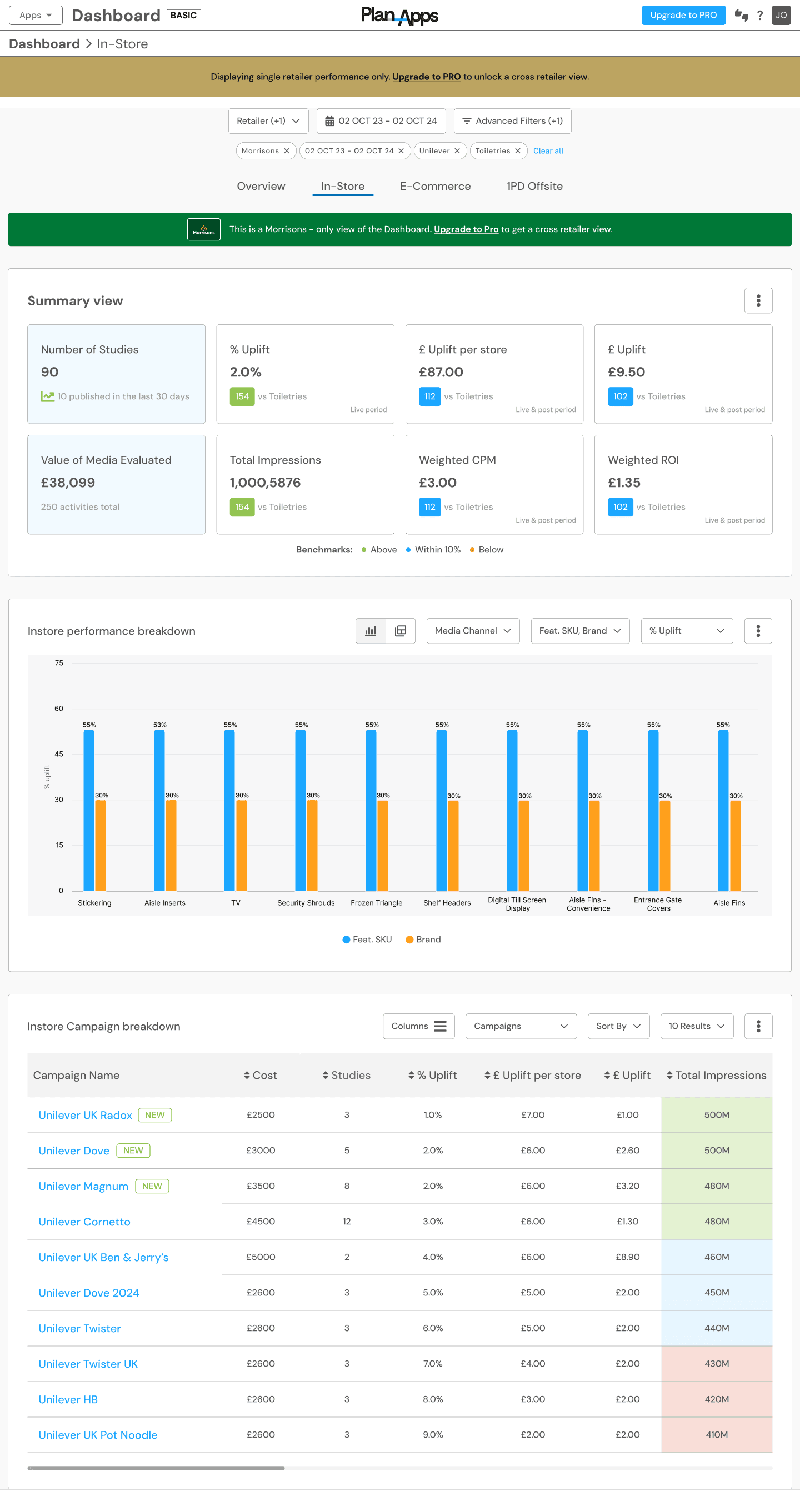
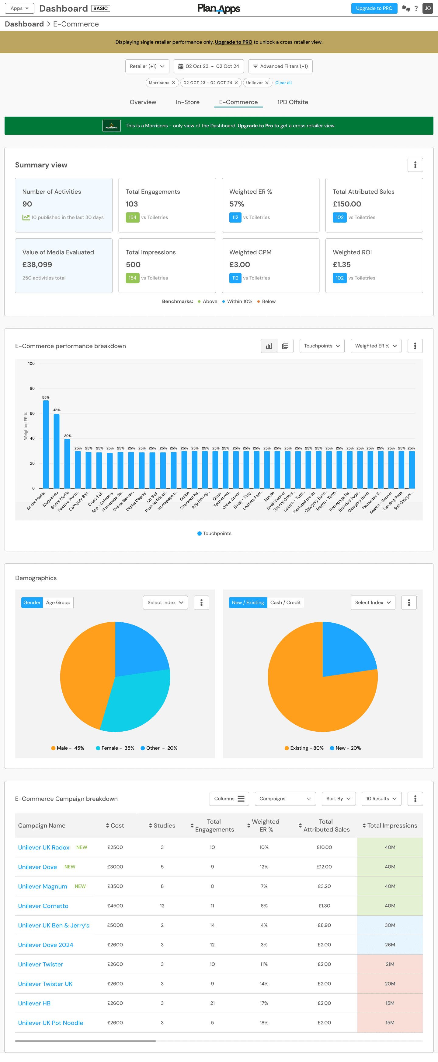
Using Balsamiq (wireframing tool) and Figma design software, I created the initial low-fidelity wireframes for Dashboard 3.0, covering all four key sections: Overview, In-Store, E-commerce, and 1PD-Offsite. The wireframes were designed with a strong focus on UX architecture, considering the needs of each user type while adhering to modern dashboard design trends and UI best practices.
To ensure alignment with business and technical requirements, I organized stakeholder review meetings to present the wireframes and gather early-stage feedback. Developers were included in these discussions to assess technical feasibility and ensure the designs aligned with current product development capabilities.
All feedback was recorded, synthesized, and incorporated into iterative design improvements. I conducted multiple rounds of stakeholder reviews, refining the wireframes based on input, until the design was polished enough to be presented to external users, including RMNs and brands, for further validation.
Below are the the low-fidelity wireframes I created for both the dashboard PRO (subscriber version) and the Basic (Guest user version).
Dashboard tabs wireframes in Balsamiq:


Objective: Generate and refine ideas to enhance the dashboard experience.
Using Balsamiq (wireframing tool) and Figma design software, I created the initial low-fidelity wireframes for Dashboard 3.0, covering all four key sections: Overview, In-Store, E-commerce, and 1PD-Offsite. The wireframes were designed with a strong focus on UX architecture, considering the needs of each user type while adhering to modern dashboard design trends and UI best practices.
To ensure alignment with business and technical requirements, I organized stakeholder review meetings to present the wireframes and gather early-stage feedback. Developers were included in these discussions to assess technical feasibility and ensure the designs aligned with current product development capabilities.
All feedback was recorded, synthesized, and incorporated into iterative design improvements. I conducted multiple rounds of stakeholder reviews, refining the wireframes based on input, until the design was polished enough to be presented to external users, including RMNs and brands, for further validation.
Below are the the low-fidelity wireframes I created for both the dashboard PRO (subscriber version) and the Basic (Guest user version).
Dashboard tabs wireframes in Balsamiq:


Low fidelity Dashboard PRO wireframes in Figma:


Low fidelity Dashboard Basic wireframes in Figma:


Design & Prototyping
Objective: Develop high-fidelity designs and interactive prototypes for testing.
After multiple stakeholders and users reviewed the wireframes, the next phase involved developing high-fidelity prototypes. Using the design system and style guides as a foundation, I leveraged reusable components where possible to ensure consistency and efficiency. I created all high-fidelity user flows in Figma, utilizing its prototyping tools to build clickable interactive experiences before presenting them to stakeholders and users for further review.
Dashboard Overview tab high fidelity -
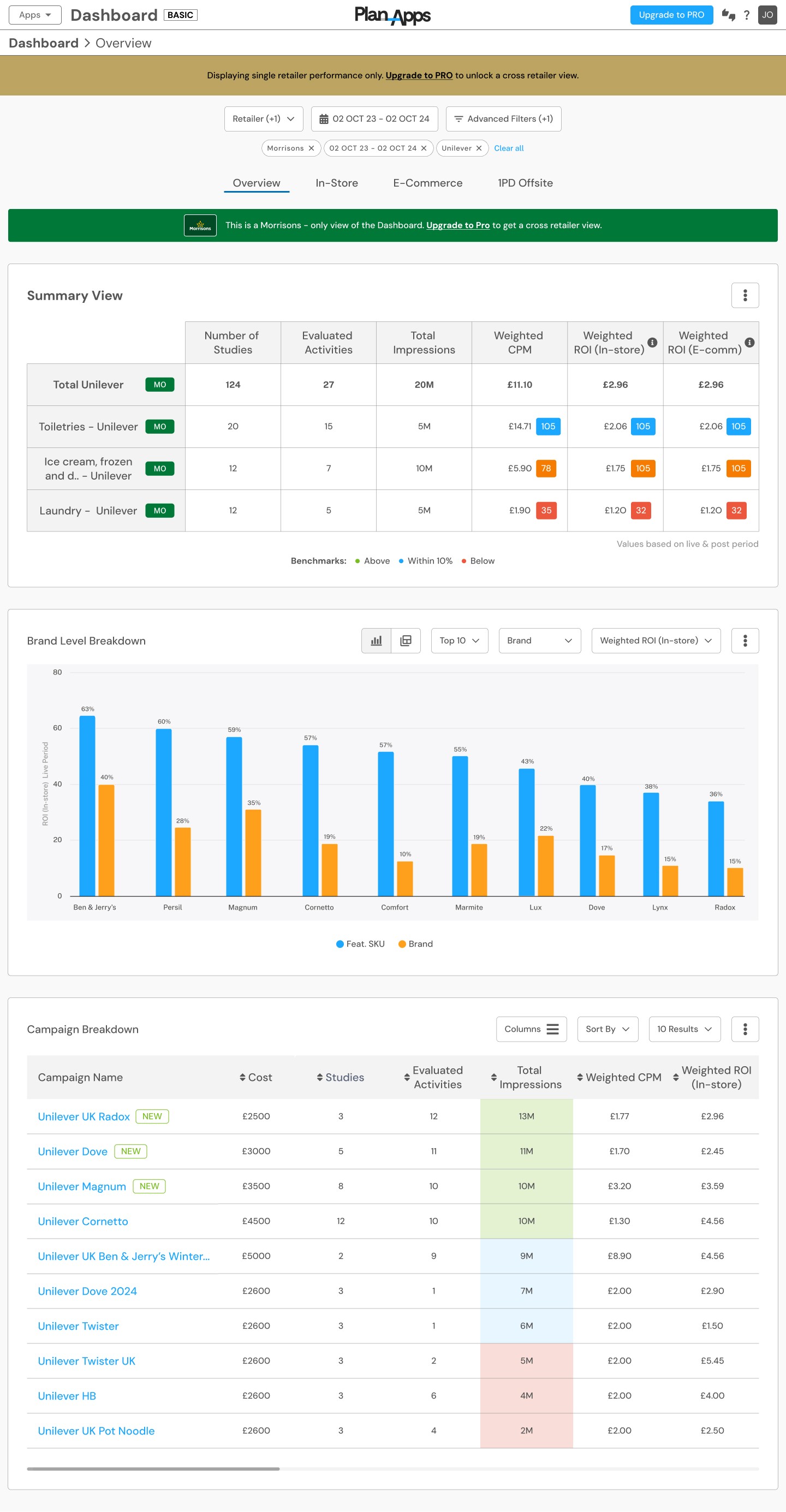
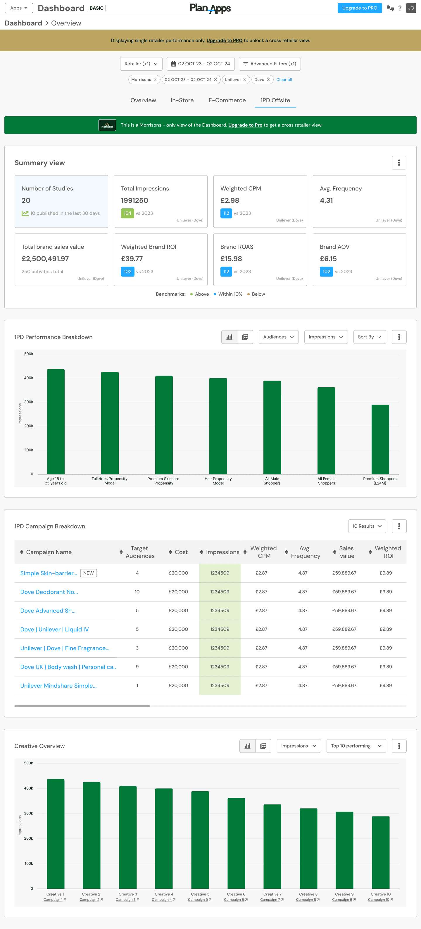
Stage Overview -
High-Fidelity UI Design: Designed a modern, visually engaging dashboard that balances data-rich content with clarity.
Interactive Prototypes: Built clickable prototypes for usability testing and stakeholder feedback.
Design System & Components: Established a scalable design system with reusable UI components for consistency.
Development Handoff & Launch
Objective: Collaborate with developers to ensure a smooth transition from design to implementation.
Design Handoff: Provided detailed design specifications, annotations, and prototypes to the development team.
Collaborative Development: Worked closely with engineers to ensure pixel-perfect implementation and maintain design integrity.
Final QA & Testing: Conducted final quality assurance checks to ensure functionality, responsiveness, and usability.
Post-Launch Evaluation & Continuous Improvement
Objective: Monitor performance and optimize based on user behavior.
User Feedback Collection: Gathered feedback post-launch to understand real-world usage.
Analytics Tracking: Monitored key metrics (e.g., engagement, feature adoption, AI recommendation usage).
Continuous Iteration: Planned future updates based on data insights and evolving user needs.
Results & Impact of Dashboard 3.0
Following the launch of Dashboard 3.0, we observed significant improvements in user engagement, efficiency, and satisfaction. The combination of AI-driven recommendations, improved filtering, and a more intuitive interface led to a more seamless experience for our users.
Key Metrics & Insights
📈 Increased User Engagement:
Hotjar Heatmaps showed high interaction levels with key dashboard elements, particularly AI-driven recommendations and enhanced filtering features.
Users spent 35% more time exploring insights and reports compared to Dashboard 2.0.
🚀 Improved Efficiency & Decision-Making:
60% faster report generation and data filtering, reducing time spent on manual analysis.
75% of users reported that AI-powered recommendations helped them make quicker, data-driven decisions.
⭐ Higher User Satisfaction:
User retention increased by 40% post-launch, indicating strong adoption and satisfaction.
90% of users found the new design significantly more intuitive and easier to navigate.
User Feedback & Testimonials
Capture (Brand & Retail Partners)
"The new dashboard has completely changed how we analyze data. The AI recommendations are a game-changer, helping us identify key opportunities we would have otherwise missed. Filtering and customization options are finally on par with what we need!"
Retail Media Networks (RMNs)
"Dashboard 3.0 is exactly what we needed—simple yet powerful. The ability to integrate first-party data has significantly improved our targeting accuracy. The engagement
heatmaps show that our teams are spending more time on insights that matter."
AB InBev (Brand User)
"The previous version lacked real-time insights, but now we can quickly access AI-driven reports with actionable recommendations. The intuitive design allows our teams to collaborate more efficiently across multiple markets."
Final Impact Summary
More intuitive & efficient workflow → Users complete key tasks 30% faster.
Stronger adoption & engagement → Heatmaps showed increased interaction with AI-driven insights.
Improved data-driven decision-making → Users felt empowered by AI recommendations.
Enhanced user experience → 90% of users preferred Dashboard 3.0 over the previous version.
By leveraging Hotjar heatmaps, real-time analytics, and direct user feedback, we ensured that Dashboard 3.0 delivered a highly engaging, intuitive, and impactful experience for our diverse user base.
Conclusion
The UX process for Dashboard 3.0 was user-centered and research-driven, ensuring an intuitive, AI-powered, and scalable product. By leveraging user insights, iterative design, and continuous improvements, we successfully addressed key pain points and enhanced decision-making for brands.
A major upgrade was the introduction of cross-retailer comparison, replacing the single-retailer view in Dashboard 2.0. This feature allowed users to analyze performance across multiple retailers, optimizing ad spend and identifying new opportunities.
Our close collaboration with users, including Capture, RMNs, and AB InBev, played a key role in shaping the final design. User interviews, usability testing, and Hotjar heatmaps provided valuable insights, helping us refine the dashboard for better usability and engagement. The iterative approach ensured that the final product met real-world needs and delivered a seamless experience.
With a focus on simplicity, intelligence, and scalability, Dashboard 3.0 significantly improved efficiency and user satisfaction. Its success highlights the power of a user-centric approach in building impactful digital products that drive real business value.