Thredd Product Design System
Complete product design system for Thredd
2022

Case Study Summary
Problem
Following Thredd’s rebrand from Global Processing Services, the company needed a scalable product design system to unify UI patterns and support rapid feature development across multiple products.
My role
Lead Product Designer responsible for building and maintaining the product design system in Figma and collaborating with engineers via Storybook.
Outcome
A comprehensive, atomic design‑based system integrated into the Thredd ecosystem, accelerating design and development consistency.
Project Details
Role: Product Designer - Thredd
Duration: 1 year 10 months
Team: Product Designers, Developers, Product Managers
Tools Used: Figma, Storybook
The Problem
Why Thredd needed a design system
Thredd had just completed a major rebrand and lacked a unified, scalable design language.
Inconsistent components across products were leading to inefficiencies and increased dev/design debt.
A structured design system was essential to ensure brand consistency, reusable components, and design standards across teams and products.
Hypothesis
By building a modular, atomic design system with components transferable to Storybook, we can streamline collaboration between design and development, ensure consistent UI across products, and speed up the creation of future features and designs.
Business Goals
Establish a single source of truth for all UI components and design patterns
Enable faster design iteration and reduce repetitive work
Improve cross-team collaboration between designers and developers
Support future scalability of Thredd’s product ecosystem
Research & Discovery
Competitive Analysis: Studied design systems from Atlassian, Shopify, Ant, Salesforce, GOV.UK, Material, IBM, and Apple to understand best practices in component structure, documentation, and maintainability.
Atomic Design Methodology: Applied an atomic design framework — breaking UI into Atoms, Molecules, Organisms, Templates, and Pages — to create a modular and reusable system.
Stakeholder Workshops: Engaged product managers, engineers, and designers to understand pain points, component usage, and future needs.
Gap Analysis: Identified inconsistencies in typography, color, spacing, and component behaviour across products
User Personas / Users
While this is a design system, the “users” are internal teams:
Designers: Need a consistent and reusable set of components for rapid prototyping and UI consistency.
Developers: Need accurate, documented components that can be transferred to Storybook for implementation.
Product Managers: Need assurance that UI and UX standards are maintained across all products.
Design Evolution
Foundations & Style Guide
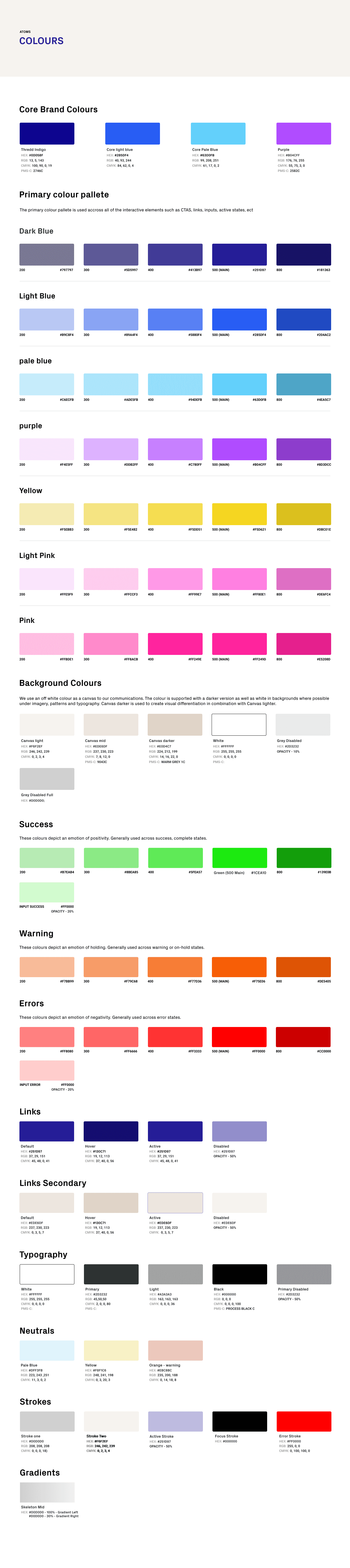
Typography, colors, spacing, iconography, shadows, grids - all defined for consistency across components and products.
Rationale: Simplified scales, aligned with the brand, and designed for accessibility.


Component Library
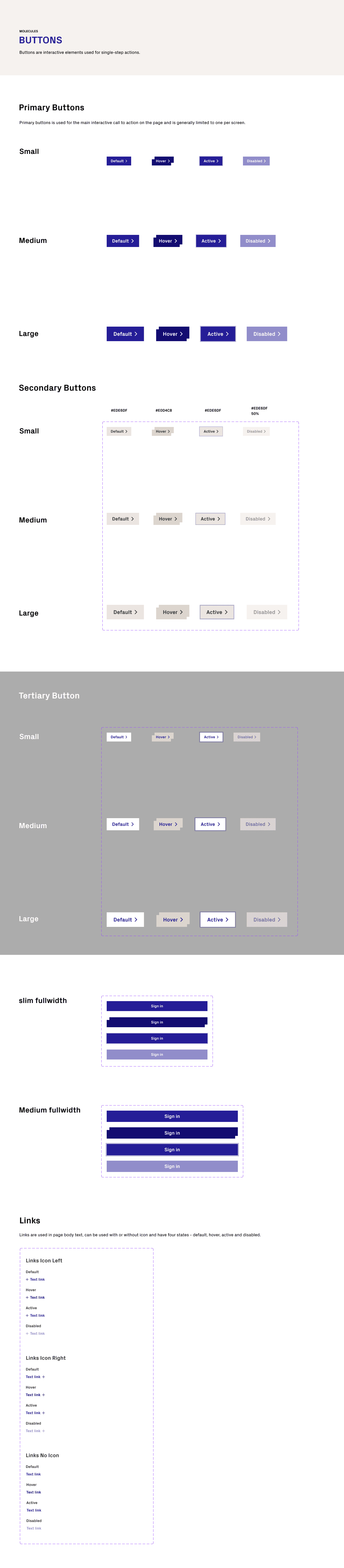
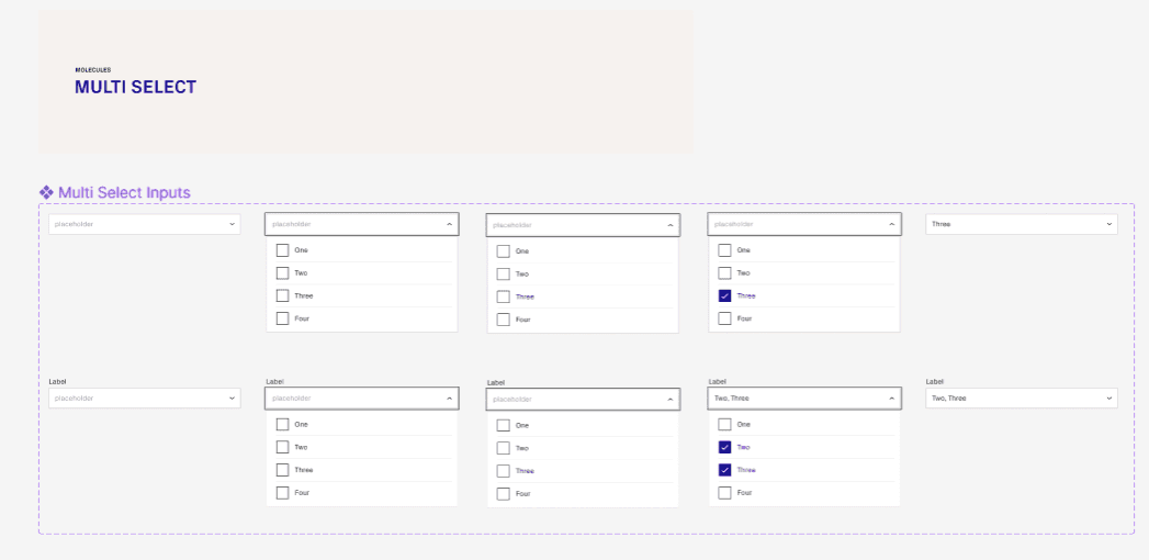
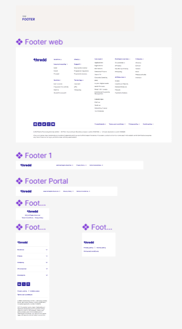
Built reusable UI components (buttons, inputs, alerts, media, headers/footers) in Figma.
Each component defined with variants, states, and responsive behaviour.
Components were documented and transferred to Storybook to bridge design and development.


Testing
Internal reviews with designers and developers to validate component usability and technical feasibility.
Feedback incorporated iteratively before finalizing the system.
Ensured accessibility standards and responsive behaviours were consistent across all components.
Product Design System - Engineering & Product Handover
This was a critical part of the project and a key focus of my role: ensuring the design system could be accurately implemented, easily maintained, and scaled across products through close collaboration with engineering and product teams.
Design System Preparation
Before handover, I ensured the design system was fully production-ready:
Finalised all core UI foundations (typography, colour, spacing, grids, iconography)
Completed reusable components (buttons, inputs, modals, cards, tables, alerts)
Defined states and behaviours (hover, focus, disabled, error)
Validated accessibility standards (contrast, focus states, WCAG alignment)
Structured files for easy navigation and export in Figma
This ensured engineers received a clean, consistent, and scalable system with no ambiguity.
Developer-Focused Documentation
I provided clear, practical documentation tailored to how engineers actually work:
Design System Overview
A concise explanation of the system’s goals, principles, and how it was designed to scale across Thredd’s products.
Component Breakdown
Each component included:
Usage guidelines
Variants and states
Behavioural rules
Linked Figma components and prototypes for context
Figma Dev Mode & Styling Access
Components were prepared in Figma Developer Mode, allowing engineers to:
Inspect spacing, typography, and colour values
Extract CSS styling and tokens directly
Reduce interpretation errors and speed up implementation
Responsive & Accessibility Guidelines
Clear rules for responsiveness, breakpoints, and accessibility compliance.
Accessibility Standards & Tooling
All accessibility checks were carried out using current WCAG guidelines and modern tooling to ensure accuracy and compliance:
WCAG 2.1 AA standards used as the baseline across all components
Figma Accessibility Plugins, including:
Able – for colour contrast and palette validation
Stark – for contrast checks, focus order, and visual impairment simulation
Manual accessibility reviews, including:
Focus state visibility
Component hit-area sizing
Readability and hierarchy for data-dense layouts
Accessibility considerations were documented alongside each component so engineers clearly understood why decisions were made — not just what to build.
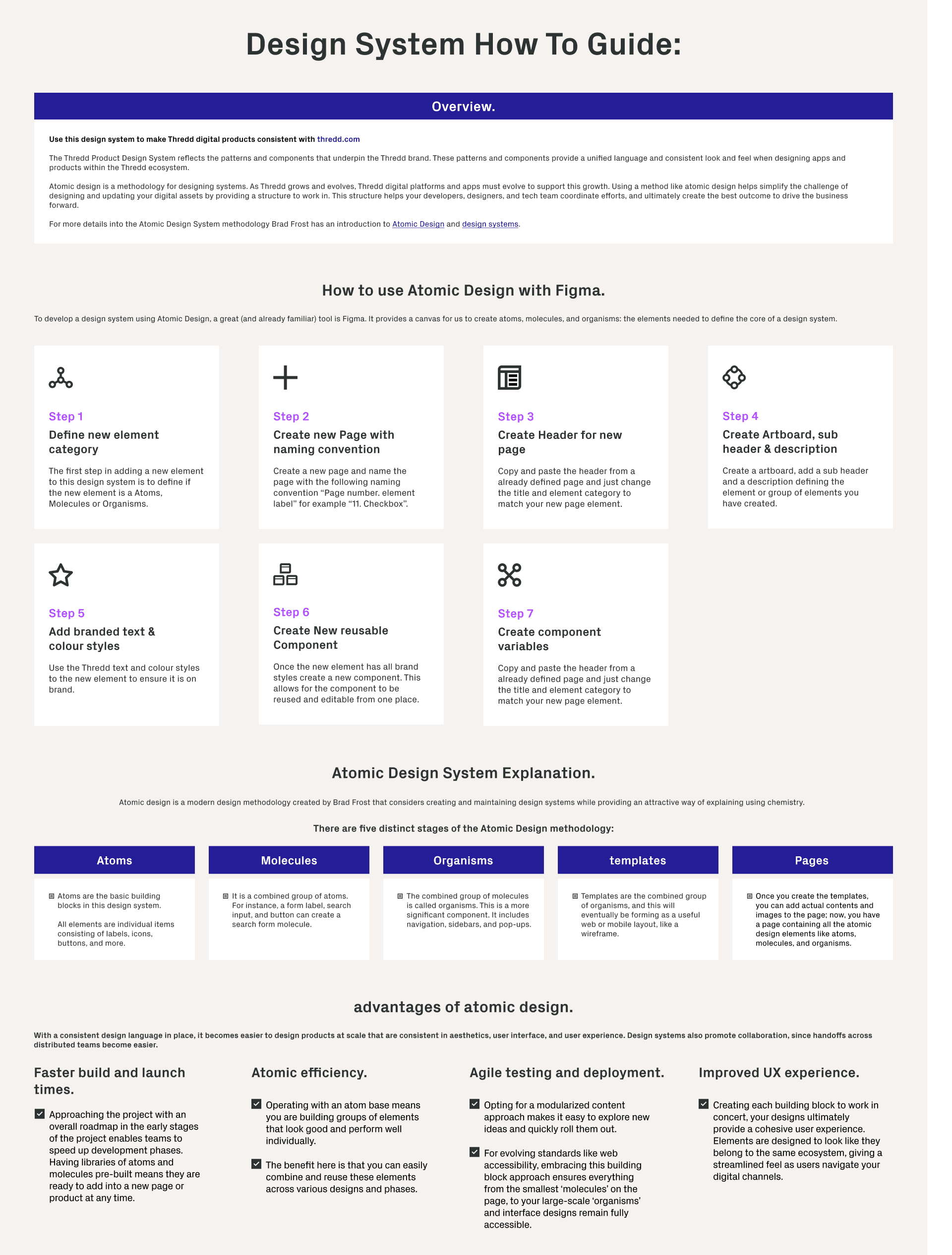
Design System How-To Guide
I created a Figma “How To” guide to reduce handover friction and help engineers navigate the Atomic Design structure and build components accurately in Storybook and production.
Post-Release Impact / Learnings / Future Roadmap
Impact:
Reusable components accelerated design and development cycles.
Storybook integration improved handoff clarity and reduced implementation errors.
Consistent UI across Thredd products enhanced overall brand cohesion.
Learnings:
Early collaboration with engineers is critical for scalable, modular design systems.
Clear documentation and structured component logic reduce misalignment across teams.
Future Roadmap:
Expand interactive component libraries
Integrate design tokens for cross-platform use
Enhance onboarding documentation for new designers and devel